


tl;dr – A graphic posted to Instagram has invited many different opinions.
A Redditor posted the following graphic (which they claim to have come across on IG), which graphs several luxury brands across X and Y axes, positioning the hotel brands according to their Accessibility vs Exclusivity, and ‘Sense of Place’ vs Standardization:
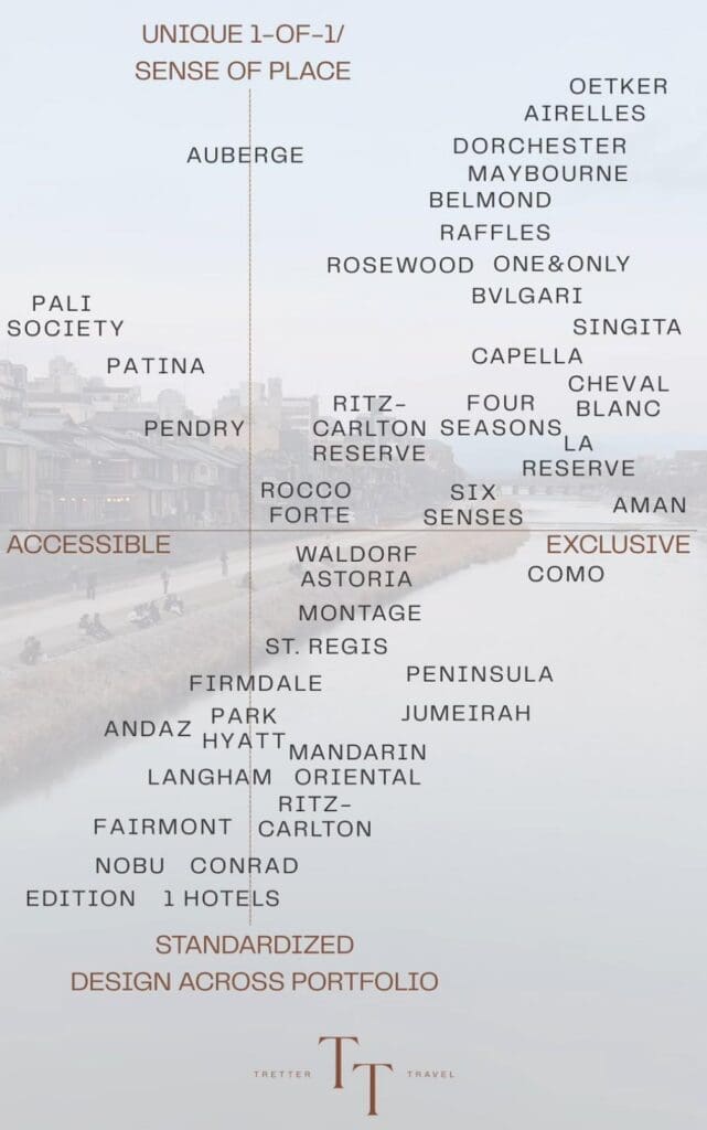
The graphic features the watermark of Tretter Travel, a travel agency. Honestly, a savvy move by those folks as it definitely appears to have folks talking.
My first thought here was one shared by many fellow commenters: why is this graph designed so poorly?
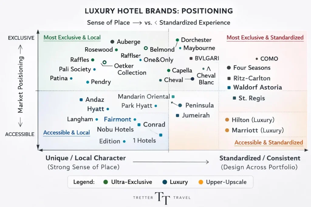
Evidently, either the design itself or the ratings must have been too irksome for at least one Redditor. Someone designed their own graphic, while also seemingly plotting the data to match their own views:
So I have many thoughts on the original graphic, but I’ll just share my biggest gripe. The author’s interpretation of ‘sense of place’ versus ‘standardization’ is bizarre. Some of the brands rated highly in the unique 1 of 1 ‘sense of place’ quadrant quite literally embody the idea of a standardized offering – i.e., the Four Seasons.
This is minor, but I’d be curious as to what (if any) methodology went into choosing the brands that made it onto the graphic (versus those that were left off)?
It’s weird to include like Pendry, Mandarin Oriental, Fairmont, Langham, St. Regis, Waldorf Astoria, Ritz- Carlton, while excluding brands like Corinthia, Kempinski, Regent, Banyan Tree, and Shangri-La.
Perhaps the authors simply put on brands they were personally familiar with (or limited the graphic to brands they had stayed at)?
What’s your take?